Using Dripsy
Dripsy is an almost-drop-in replacement for React Native's UI components.
Change your imports from react-native to dripsy.
Before
import { View, Text } from 'react-native'After
import { View, Text, H1, P } from 'dripsy'Use the sx prop instead of style to use themed and responsive styles:
<View sx={{ height: [100, 400], backgroundColor: '$primary', marginX: 10, }}/>Instead of marginHorizontal, use marginX or mx, as seen on the theme-ui docs.
👀 What does Dripsy look like
Create a theme
export const theme = makeTheme({ colors: { $text: '#000', $background: '#fff', $primary: 'tomato', }, space: { // recommended: set 0 first, then double for consistent nested spacing $0: 0, $1: 4, $2: 8, $3: 16, $4: 32, $5: 64, $6: 128, $7: 256, }, fontSizes: { $0: 12, $1: 14, $2: 16, $3: 18, $4: 24, $5: 28, $6: 32, }, text: { h1: { fontSize: '$2', // 16px, from `fontSizes` above }, p: { fontSize: '$0', // 12px from `fontSizes` mb: '$3', // 16px from `space` }, },})...and build a beautiful, responsive UI
<Text sx={{ color: '$primary', padding: ['$1', '$3'], // [4px, 16px] from theme.space }}> Themed color!</Text>...you can even use "HTML" elements
import { H1, H2, P, A } from 'dripsy'const Header = () => ( <H1 sx={{ color: '$text', // #000 from theme.colors fontSize: '$2', // 24px from theme.fontSizes }} > Header! </H1>)Credit to Evan Bacon for @expo/html-elements, used above!
sx Factory
If you need fine-grained theme usage, you can pass a function to sx:
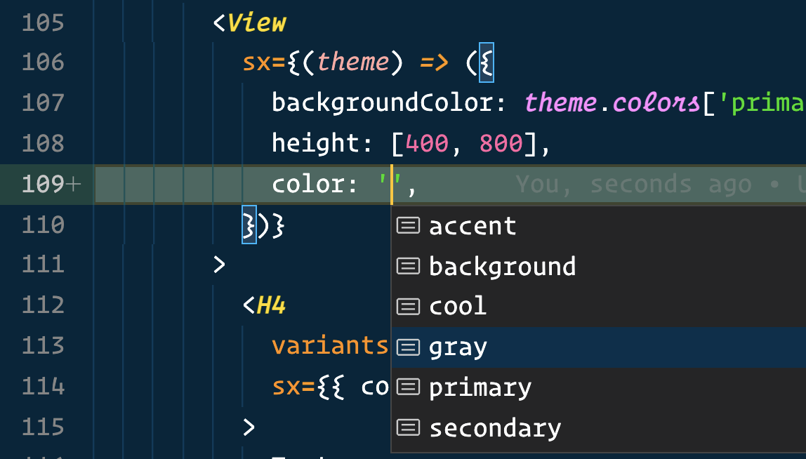
The function receives your app's theme (with Intellisense) and should return the sx style.